christine schuhbeck
“i like to think, that my exhibition enter the void suggests an invitation or an opportunity to delve into an unknown or mysterious realm. it implies a journey into stillness or an undefined space, where one can explore and discover. it is an invitation to evoke a sense for curiosity, adventure and perhaps a hint of introspection, as it implies stepping beyond familiar boundaries, into an uncharted territory of the mind.“ - christine schuhbeck
christine schuhbeck is a photographer and artist whose work showcases a diverse range of media and techniques, reflecting her admiration for excellence in technique and attention to beauty and detail. schuhbeck draws inspiration from a variety of artists and her aesthetic philosophy is rooted in a profound appreciation for the sensual aspects of art, such as texture, colour, and composition.
alongside to her career in art, schuhbeck worked in commercial photography, where schuhbeck honed her skills in retouching and gained a deep understanding of composition, lighting, and arrangement. this experience cultivated her attention to detail and knowledge of colour, influencing her artistic practice and approach to framing and lighting. schuhbeck translates her meticulous nature into her creative process, where schuhbeck experiments with different media and techniques, always seeking to elevate the aesthetic and push the boundaries of her craft.
spazio would like to thank the support of suzana diamond-roever and her contribution to the curation, editorial and production of the exhibition.
-
schuhbeck‘s creative process is influenced by her curiosity for materials and their potential combinations. schuhbeck collects and experiments with various items, from scraps and leftovers to the images, shapes, shades, and colours that fill her mind. her studio resembles a small hardware store, with a variety of materials and tools at her disposal.
-
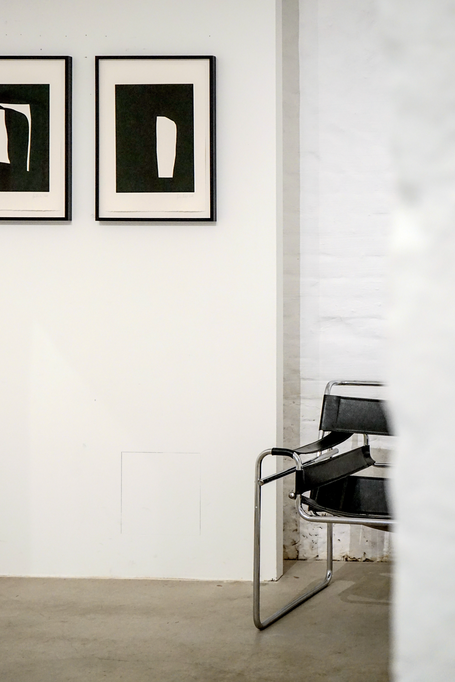
black plays a significant role in schuhbeck‘s work, drawn to its attributes of safety, quietness, elegance, and power, as well as its mystic and unknown qualities. schuhbeck explores the nuances and shades of black, combining it with different materials to create subtle layers and the appearance of light. white, the absence of color, on the other hand, schuhbeck finds less forgiving, requiring a strong motive to incorporate it into her work.
-
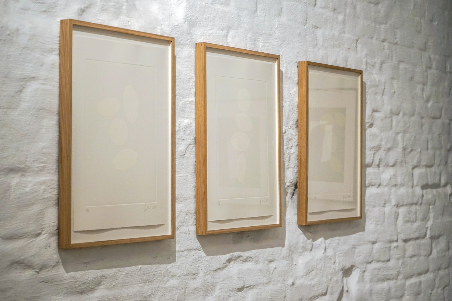
her work extends beyond traditional photography, delving into gravure printing, mezzotint, resin, fabric, and paint. schuhbeck employs the ancient mezzotint technique to create rich and velvety black backgrounds, which schuhbeck then manipulates through overpainting, collaging, embossing, or omitting shapes. schuhbeck also experiments with resin, saturating velvet fabric to capture its soft and tender quality in a three-dimensional sculptural form.
-
schuhbeck‘s recent exploration of sketching offers her a sense of freedom and ease, liberating her from the pressure of perfection. schuhbeck sets up a small desk at home, tapes a frame for composition, and lets her creativity flow without judgement. this new medium allows her to work with ease and explore new materials without the constraints of her usual meticulous approach.
-
how did you get into photography
at the beginning of my twenties i was strongly affected by the photography of nan goldin, corinne day and cindy sherman. it was raw, authentic, rebellious and felt independent. i grew up quite rural, with very limited contact to the art world. i started to see photography very differently, as a deeply fulfilling and expressive outlet for emotions and perceptions.
the photographers i started to discover revealed their inner world and i loved that. i knew that whatever i would create in the future, it needed to feel like that. it needed to reflect me. -
can you tell us a little bit about your aesthetic philosophy?
in every kind of art or craft, i adore the excellence of technique, a keen attention to beauty and detail in both, form and content.
i have a profound appreciation for sensual aspects, such as texture, color and composition and the instinctive qualities of materials. i believe in the purity of form, by rejecting the unnecessary. -
where do you find your inspiration for your work?
i get inspired by forms, shapes and contrasts in everyday objects or by the composition of ordinary things.
also through photography, admittedly often finding inspiration on instagram and by visiting an art show or a museum. my curiosity for materials and the pure need to find out how they could work together often gives me new ideas. -
i am also a bit of a collector who struggles with throwing things away. scraps and leftovers are a surprising and very satisfying source for new ideas, a new game of thoughts. i like to envision their potential further uses.
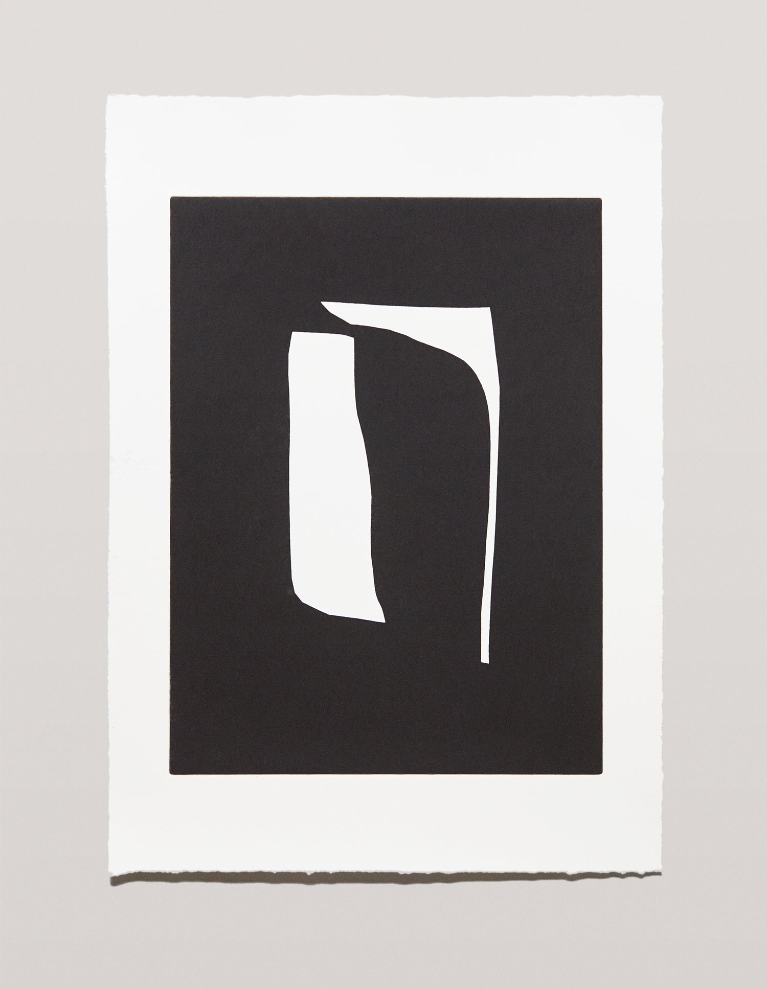
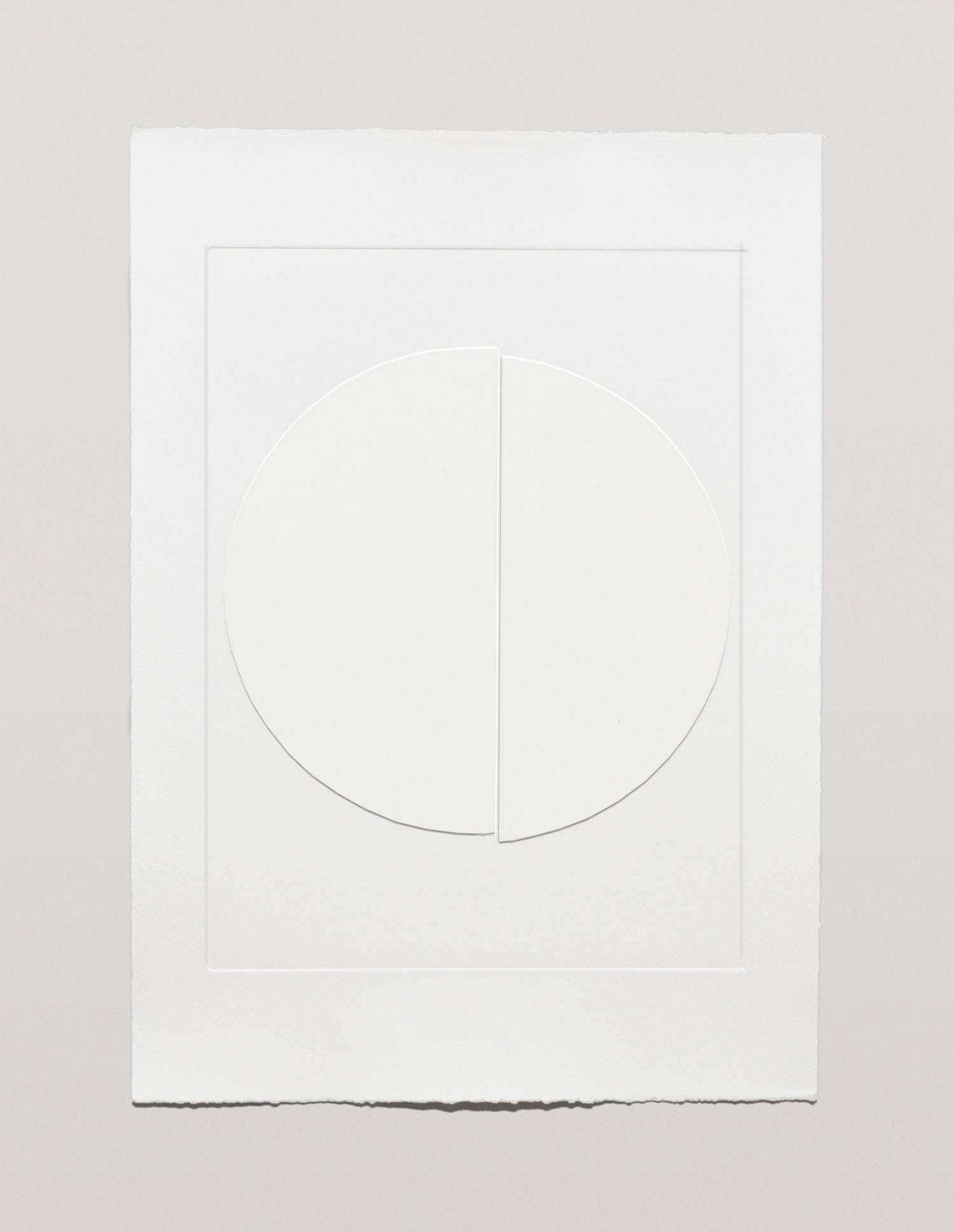
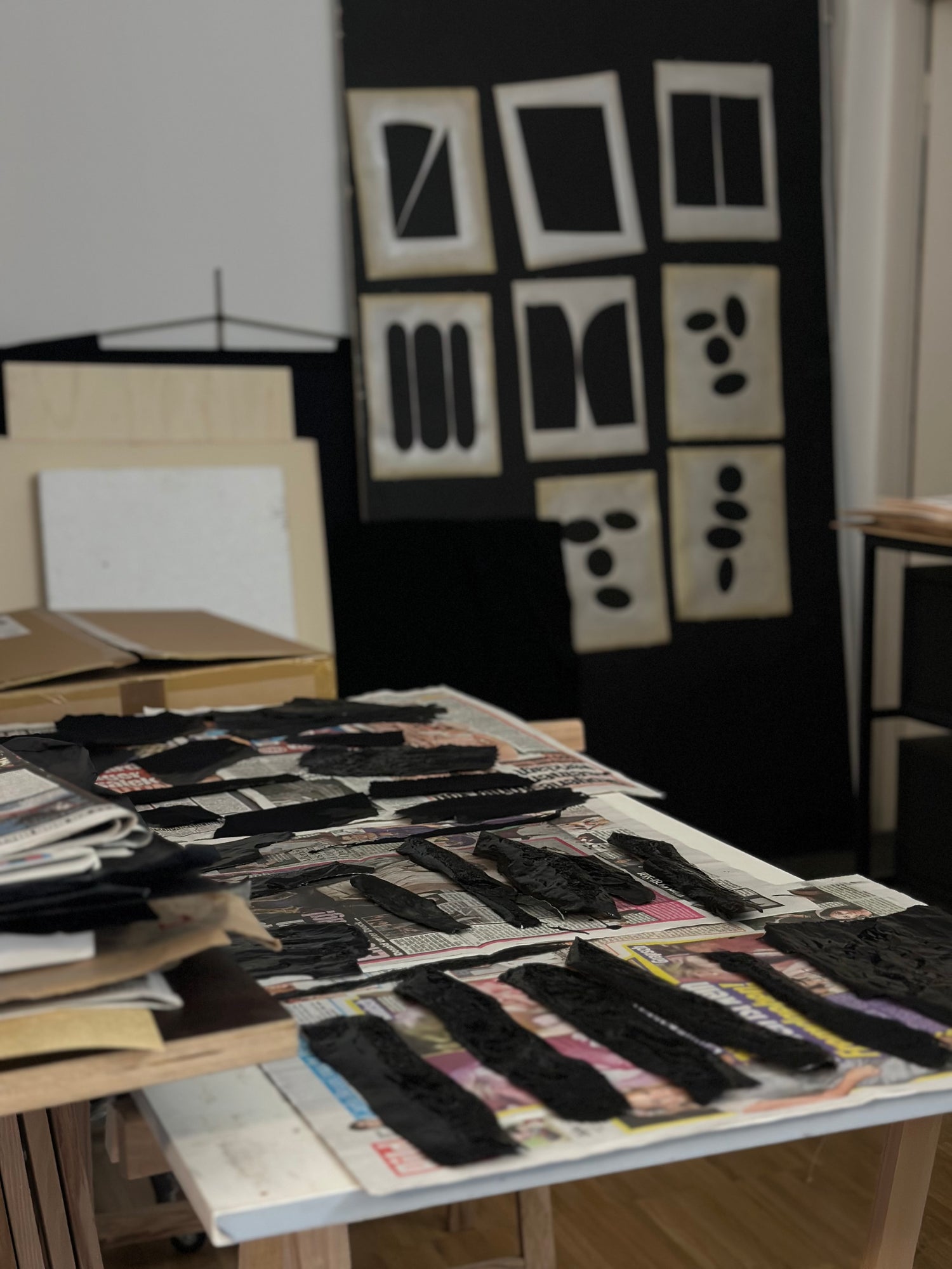
tell us a little bit about your choice to work extensively with black and white. what is it about these colours that draws you in and makes you return to? how have your worked with them separately and combined?
black is safe and quiet. it is elegant and powerful. those are already attributes i value in life. of course, the common descriptions like mystic, deep, unknown etc. do speak to me just a much. but its my strong dedication to its various possible nuances and shades, that i am drawn to. its not so much white that i want to combine with black. i am seeking the creation of light, which appears next to black in order for its depth to appear. therefore i am very curious about mixing all sorts of blacks with different materials, to create those subtle layers. i often use white as the absence of color.
i find white to be almost less forgiving than black -- it asks for a strong motive in order to work for me.
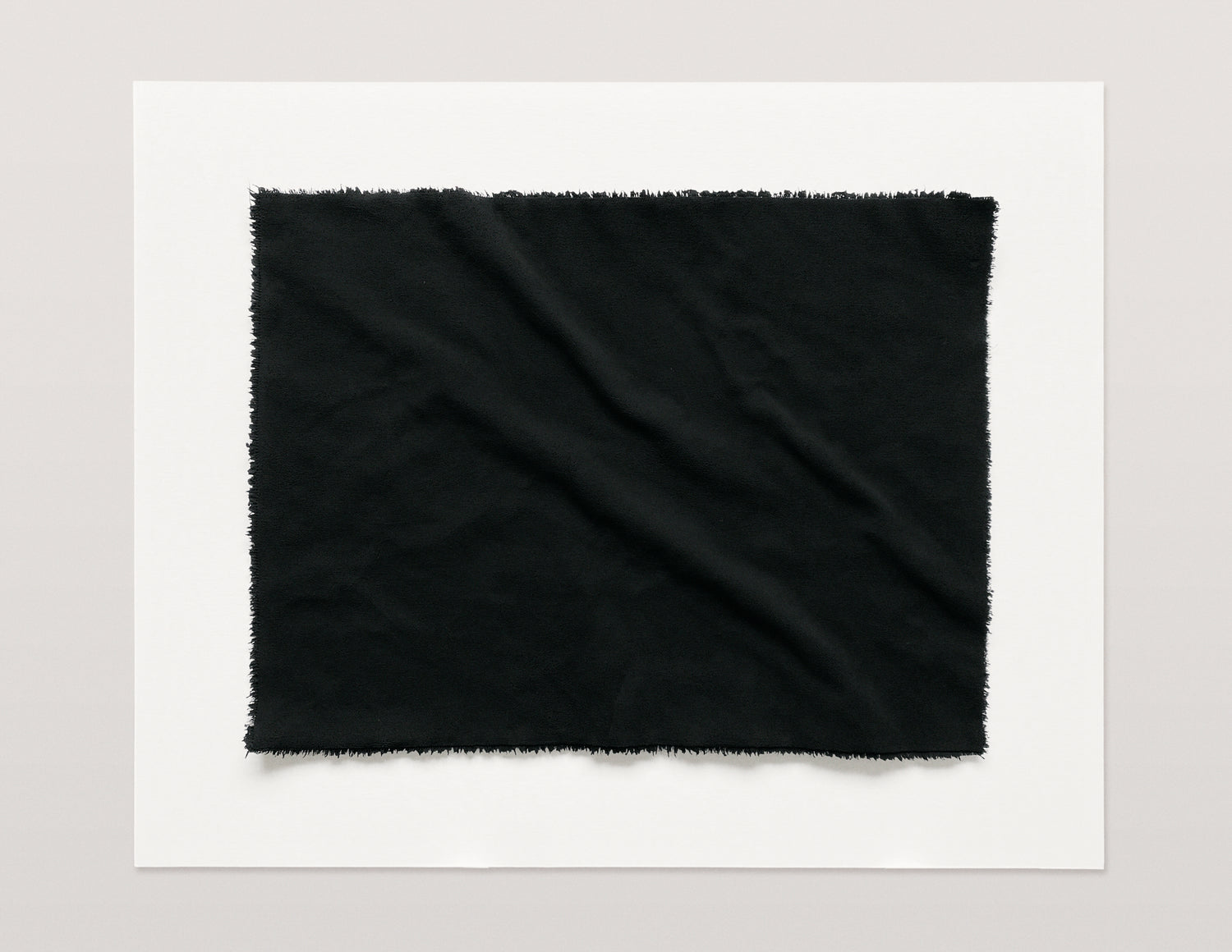
what techniques and media have you used in your various print series? which were the most rewarding to work with?
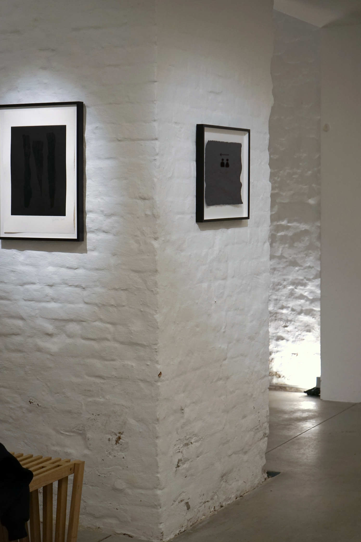
i have been using the technique of gravure printing a lot. i own a beautiful press constructed by walter barth, a dedicated printer and engineer i have learned a great deal from. for many of my works, i created a black background with the ancient mezzotint technique. it involves roughening an entire copper plate by hand with a tool called “rocker,” to create a so-called blur. the blur holds ink, resulting in an unique rich and velvety black when printed. i use that background for overpainting, collaging, embossing or omitting shapes, scraps or objects.
i also experimented with resin, fabric and paint. i saturated velvet fabric with a liquid resin mixture which then cured and hardened to a desired three-dimensional sculptural image. finally, i carefully covered the work with different layers of primer and a very deep and non-reflecting black ink, while making sure the texture of velvet was still visible.
the work is a “frozen” moment that naturally would feel soft and tender, for its point of time.
i feel very rewarded if i manage to archive a pure, true tone of color, an interesting surface or perfectly combined colours.
for me, the medium calls for the technique and vice-versa. i really love to experiment with every material i can get my hands on. a sometimes rather unorthodox approach is not uncommon. my studio is like a small hardware store.
-
tell us a bit about your blacked-out-newspaper works. what was going on at the time that inspired you to start? how long did you keep it at? when did you decide it was time to move on and why?
on february 24. 2022, russia invaded ukraine. a disaster that left many people in great disbelief and shock, not only in their understanding of peace, but also stability and security. i remember i was shaken by perhaps a naive mindset of impossibility. quickly the news simultaneously led to information overload for me, further intensifying confusion and helplessness.
on february 24.2022, i began to blacken the front page of a daily newspaper. with my beloved medium, black ink on paper, graphically and meticulously. -
initially, it was the idea of silent empathy. a contribution to solidarity and compassion for those directly affected by the conflict.
at the same time, due to the constant influence of the media, an inner emptiness spread. a feeling of alienation from oneself and one’s surroundings.
it was the sensation that despite the abundance of information conveyed through the media, a deep void and senselessness remained.
i perceived it as a constant, mostly superficial distraction. suddenly, everything seemed equally important and thus unimportant. -
for a long time, i was not aware what it meant for me. the war was going on and sometimes i felt as if another war was going on within me. often i found the continuous, daily acquisition of the newspaper and the repetitive work to be tedious. it was like a wild search for answers which never appeared. but consciously i started to reflect a restlessness within me. i realised how exhausted i was by the endless stream of information, images and messages from various sources which seemed to sharpen perspectives that were not my own. i felt detached and disengaged from my own thoughts and emotions and it led to a lack of inspiration, creativity and motivation. i had not realised yet, i could control what overpowers me.
-
nevertheless, i felt compelled to carry on painting the paper, not really knowing what it meant, nor how long it would take. it was an active decision to bring my mind and thoughts to rest for a certain time each day. a process where i found meditative pleasure, time to think, time to be silent.
i took a pause from the constant information-overload and slowly reclaimed clarity and found myself more present and focused. the work showed me the core necessity to value my priorities.
on october 7. 2023 the middle east conflict started. i stopped to blacken the front page of the daily newspaper.
while many of your works are black and white, you also delve into exploring color through your sketches. when did this start exactly and why? how is your process different at home when sketching, compared to the works you create at your studio? what is it about the format that has inspired you to experiment?
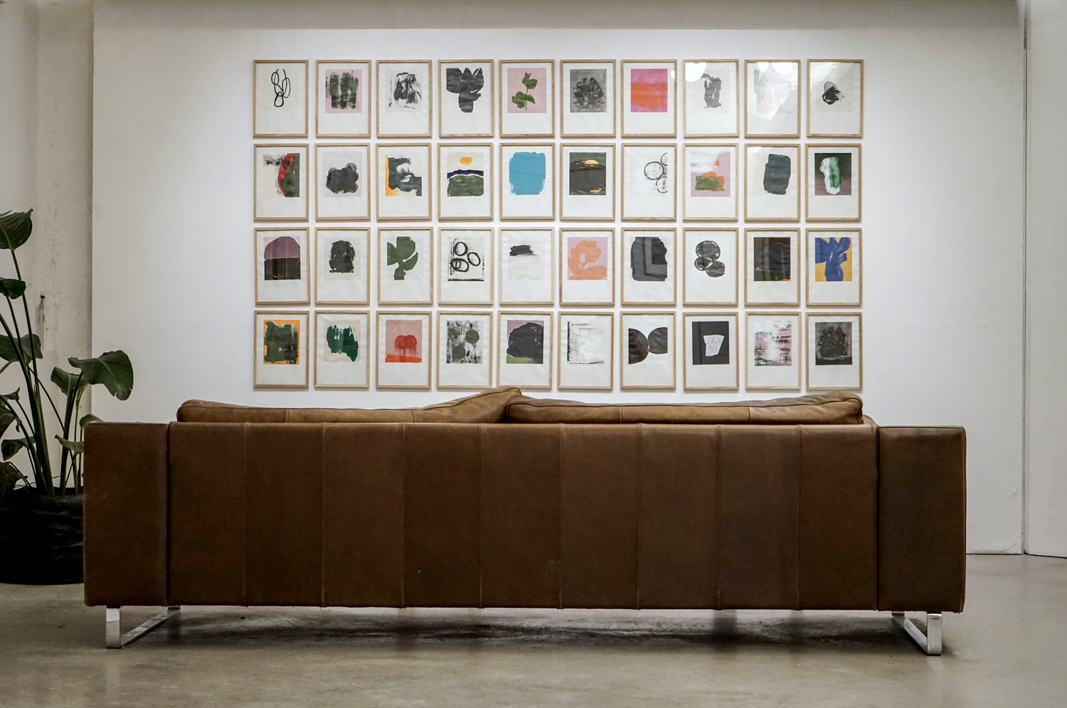
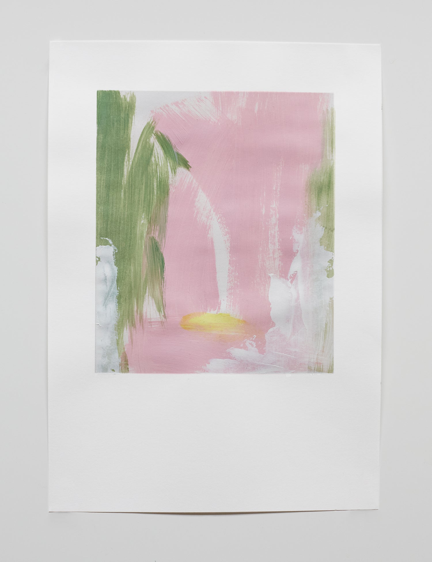
i began my sketches this year. since i have no background in painting or drawing, i am not trained in using oil, gouache, acrylic, aquarelle etc., combined or individually. i desired to learn and also to stop my mind from constantly controling my ideas, so it needed to be easy. i set up a small desk at home, bought a sketchbook, taped a frame for composition and got started. i really enjoy that it doesn’t matter if it is good, bad or awful, it is very liberating. next to exploring new materials, it is an approach to working with ease and freedom, without the pressure of perfection and purpose. i didn’t think i would show the works…..
-
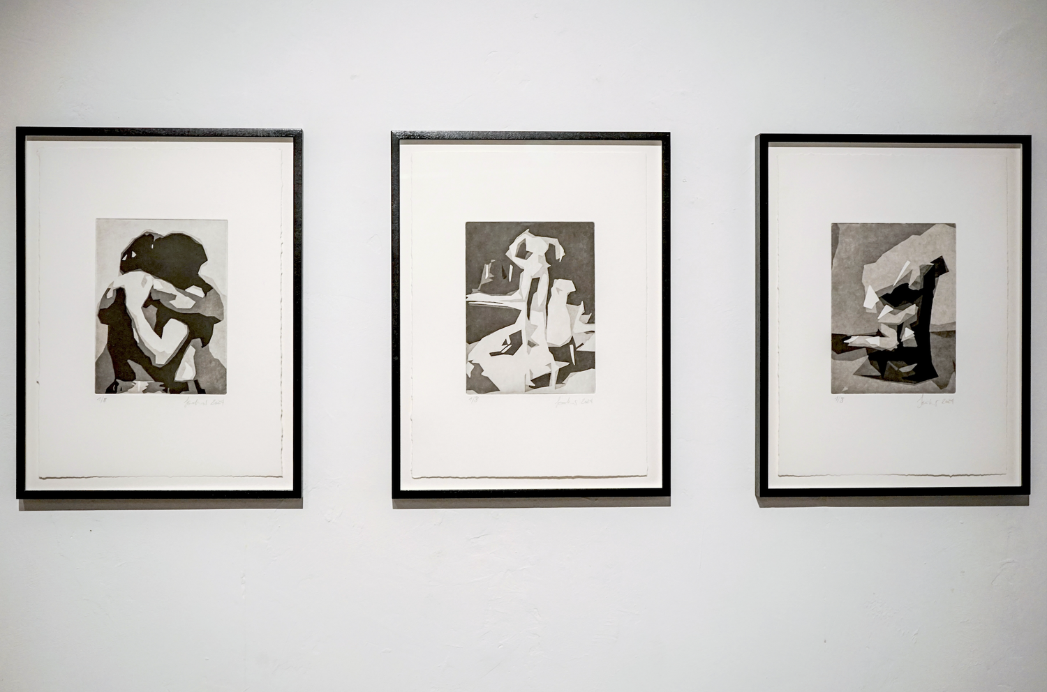
recently, through your aquatints, your figurative photography is the starting point, whereas the end result almost returns to abstraction. could you share insights into the challenges you encountered in this process, from concept to achieving the print you desire? what is it that you are trying to convey here that is different from your previous work?
-
photography is probably my most favoured inspiration for new ideas. next to an emotional message, composition and colours i always look for shapes in photographs. i have been experimenting in photoshop to carve out shapes with filters and came across a setting that simplified an image to its minimum. i reduced the picture to its basic shapes, lines and tones and the result was a simplified representation that emphasised the core composition.
-
i was thrilled. but it was challenging to find the right image for the perfect composition. i probably went through hundreds of images to find what i liked. i have worked almost two years on that project. finding the perfect shapes and tones, reproducing the layers of different tones in photoshop, ponder over the right medium to print or reproduce, how big or small it should be, what material,… on and on.
-
i tried woodcut, tried to paint them, considered silkscreen, but always saw them strongest as aquatints. the aquatint technique is one of the most challenging in gravure printing, and my experience in etching an aquatint was far from adequate. so needless to say that i got deeply involved. it took a long time and numberless tests to get to the perfect point of where the plate wanted to be.
